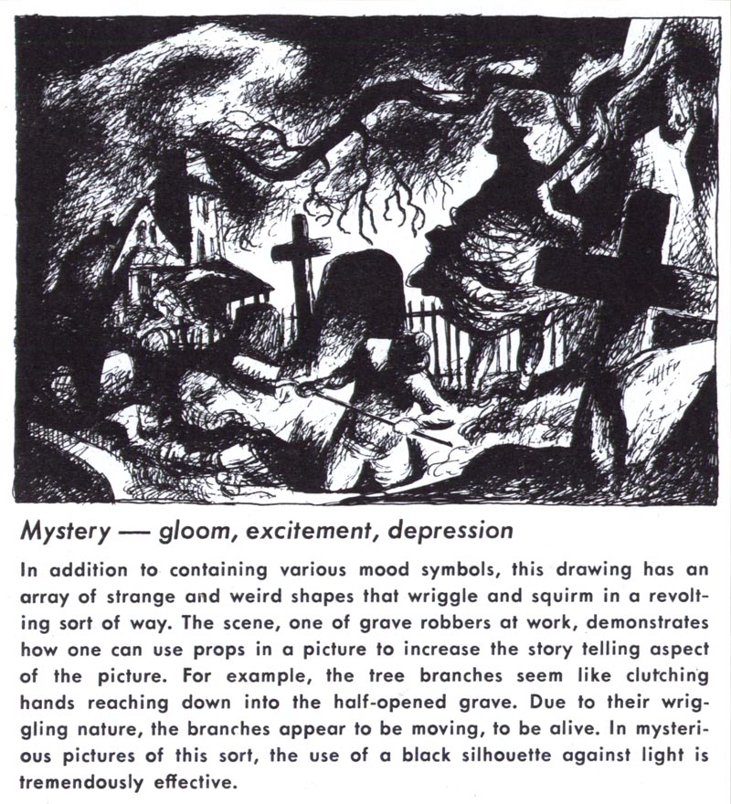
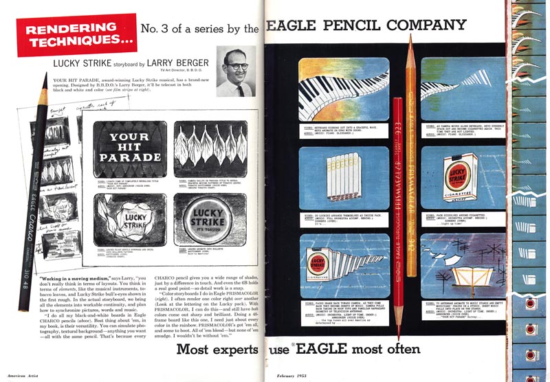
The advent of television didn't just create a new market for artists... it created a new market for art suppliers too. One of the first steps in creating a television commercial is to draw a storyboard. Astute mid-century paper manufacturers quickly began offering specialized pads of pre-drawn frames in the shape of a tv screen.
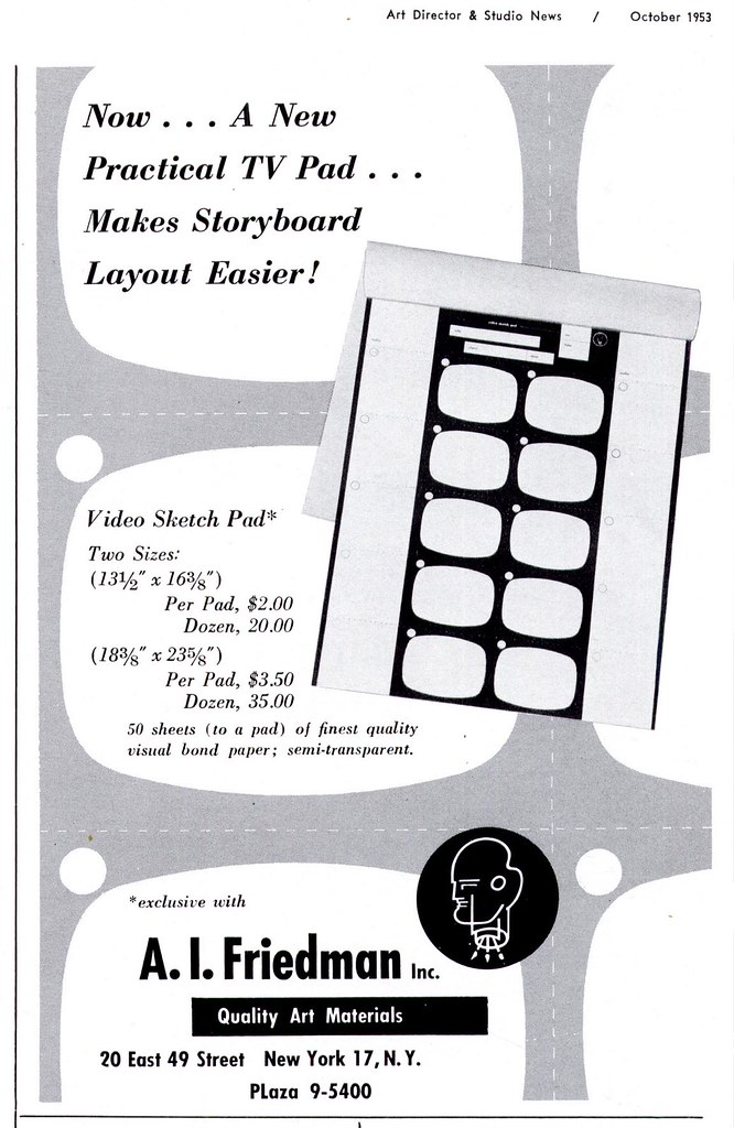
Not wanting to miss out on an emerging market, the Eagle Pencil Company jumped on the bandwagon by extolling the virtues of its coloured pencils for creating presentation - quality storyboard drawings.
Here's an interesting article from the October 1953 issue of
Art Director & Studio News.
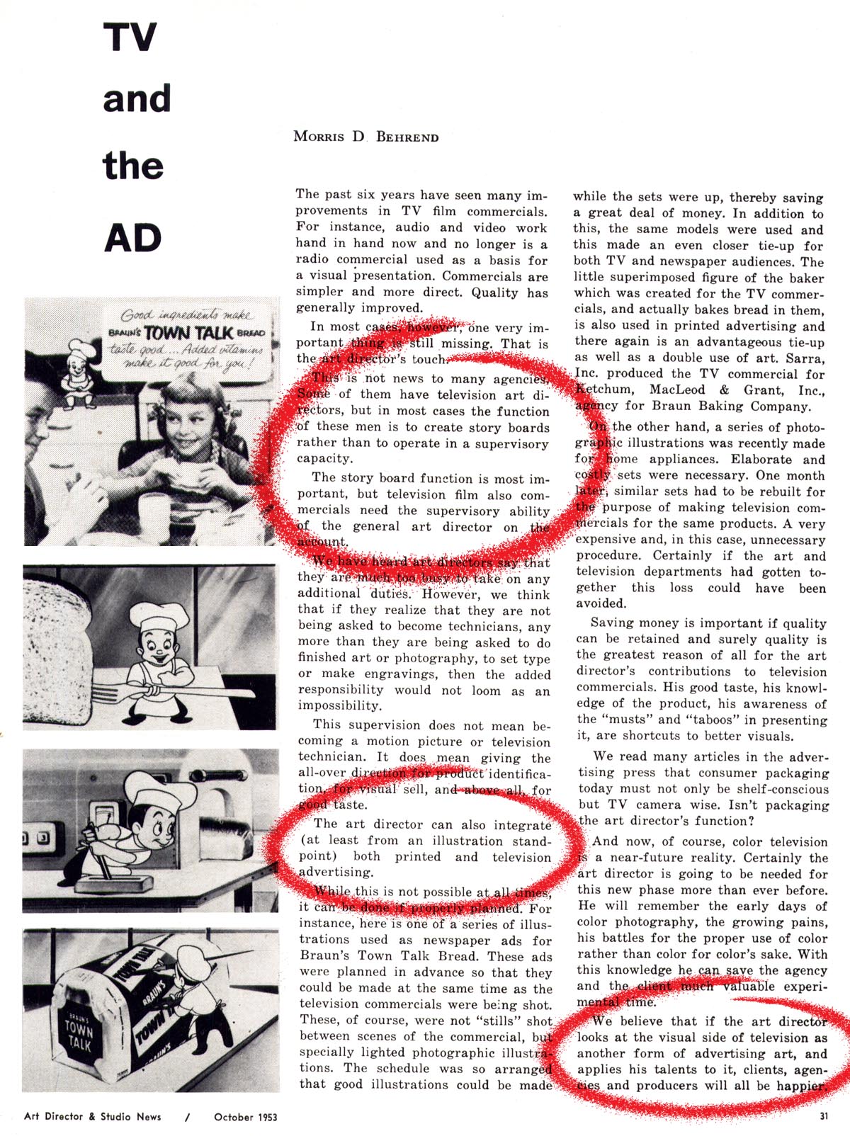
Not only does it reference the growing significance of the storyboard as a visual aid in the process of making TV commercials...

... it highlights a trend in print advertising design that began to appear in the early '50s:
the story board as print ad.
Its a trend I noticed over the years as I looked through thousands of pages of mid-century ads and articles in my old magazine collection. But I never really put two and two together until this latest series of posts.
In the introduction to the Television section of the 1952
NY Art Director's Annual, William Strosahl writes,
"The quality of commercials is improving constantly and Art Directors are a big factor in raising the standards of TV advertising. It is big business and may well represent 65% of total billings in the next two years."
That's a massive chunk of revenue for a medium so new that it was, in 1952, only being included as a category in the
NYAD Annual for the third time. It made me think, if agencies and their clients were beginning to devote the majority of their time, money and creative effort to producing television commercials, wouldn't they want to reinforce their
broadcast message in print? The
AD&SN article seems to confirm this strategy...
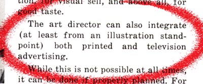
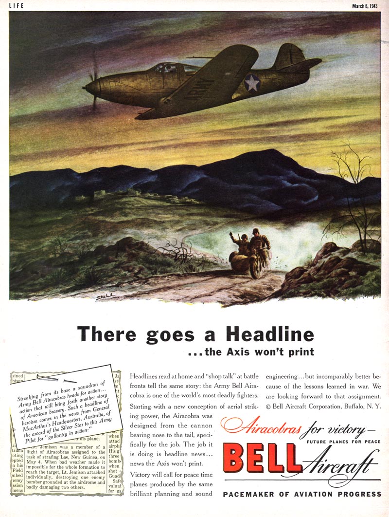
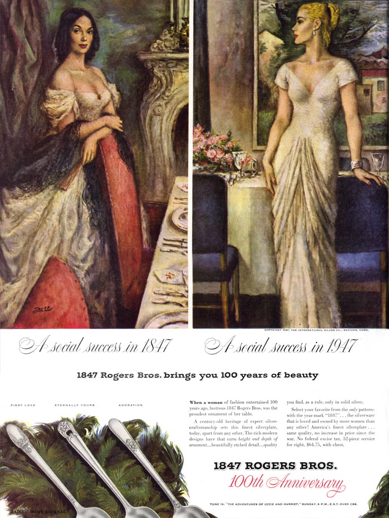
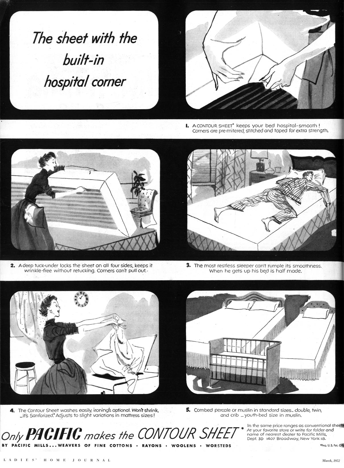
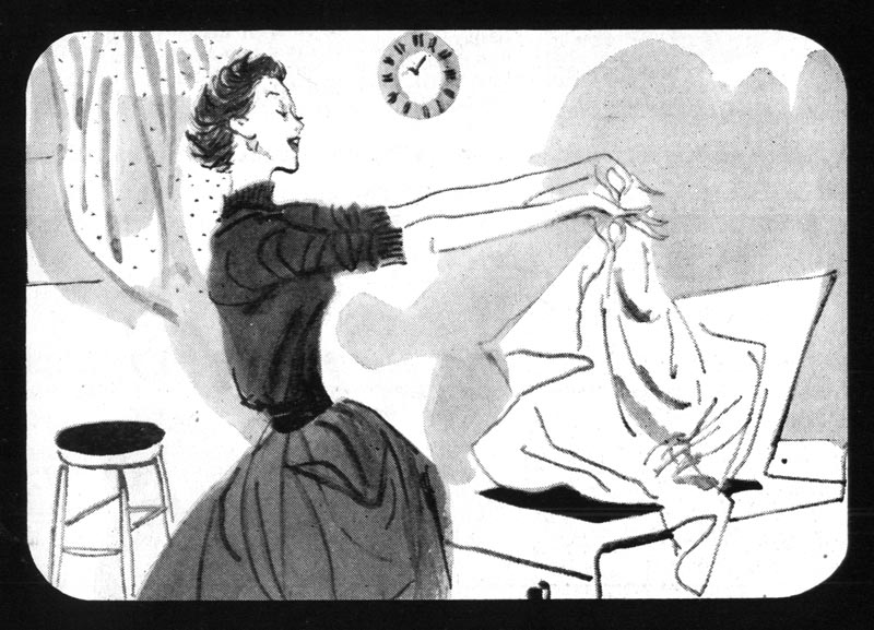
So it shouldn't be surprising to see print ads that look like a comic strip version of a TV commercial -- right down to the curved corners of the classic cathode ray television tube. Though the general public was undoubtably unfamiliar with the term, they were - half a century ago - seeing their first television storyboards.
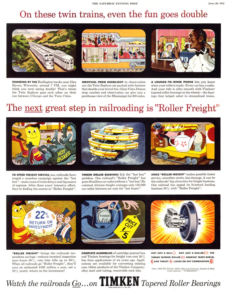
Was new artwork created for these print ads...
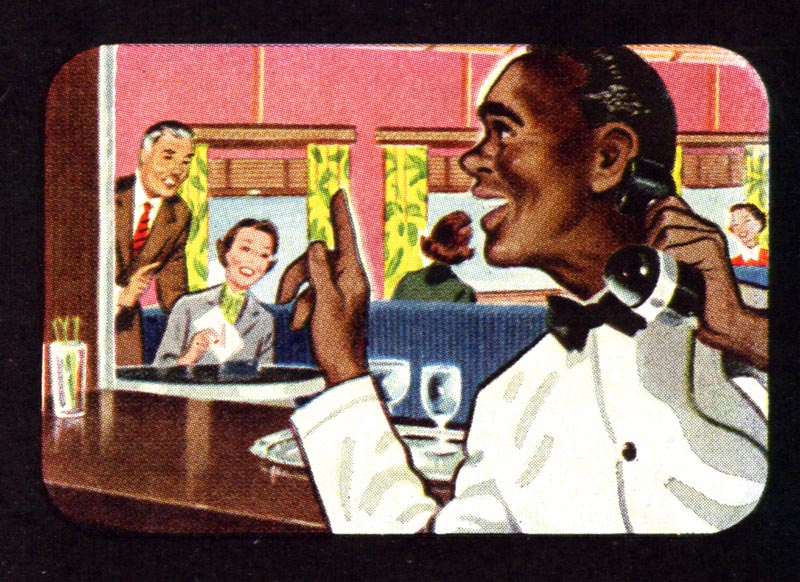
... or did agencies simply reuse the illustrations commissioned for the TV commercial? I'm really not sure.
But the
AD&SN article suggests at least some reuse. In the commercial cited in the article the author mentions that
"the little superimposed figure of the baker, which was created for the TV commercials, and actually bakes bread in them, is also used in printed advertising and there again is an advantageous tie-up as well as a double use of art."
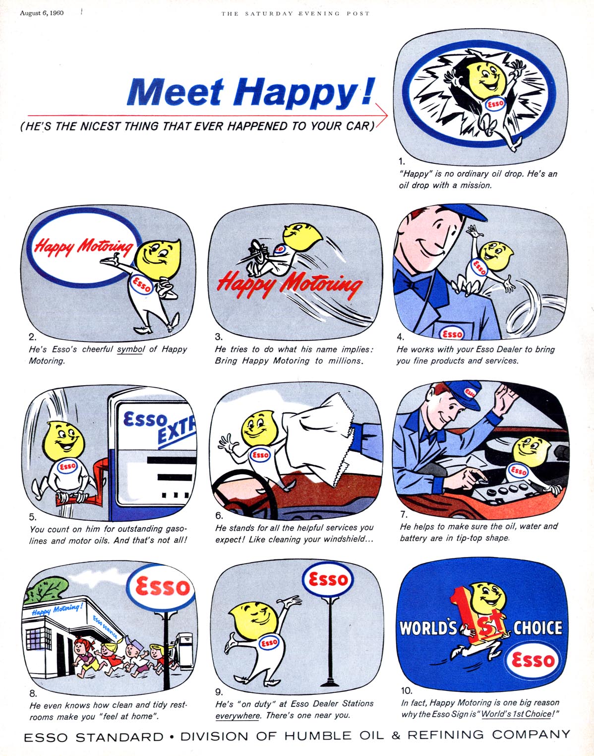
I don't want to suggest that the TV-storyboard-as-print-ad became a huge component of all print advertising - far from it - but its existence (and persistence) simply once again underscores how the game had changed. For the ad business... for the advertiser... and very definitely for the illustrator.

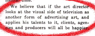
A final quote from the article to conclude the thought ( and this latest series of posts):
* My
Art for Tv Flickr set.
* Also, Bruce Hettema has a new post up about illustrator Frank Hoffman on his
P&H Creative blog
* And if you've yet to visit (and perhaps participate in) Toby Neighbors' fabulous "collaborative illustration" blog,
illostribute.com, this might be a great time to jump in: Toby's latest 'tribute' is to
pulp artist Norm Saunders - what fun!
* Finally, be sure to drop by the NCS blog for the latest
NCS Spotlight on... Eric Gurney!